Dynamite: Day 4 – Visual Effects
First off, I did a bit of bug fixing. I improved my panning by mouse drag code a bit by using gluUnProject (the same code I’m using to pick a tile with the mouse.) Before I was just kinda guessing how to pan so it wasn’t very accurate.
Next off I noticed in yesterday’s screenshot that all the tiles had lines between them. I found that this was because I’m using a 256×256 texture which I’ve now added to a texture atlas. So when GL mipmaps it down to a smaller size, the blank area between textures is getting used a bit. This forum thread seems to cover a number of options I have. The simplest solution for right now was to move the “wall” texture out of the atlas, and just leave the sprites in the atlas.
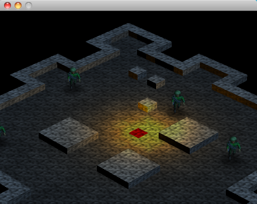
Updated screenshot. I have the walls set at 0.5 height for the moment, but it shows the fixed textures. I also added variation in the darkness of the tiles to give it all a dirtier look.
Due to high demand, I decided to work on the textures a bit more. I found that www.cgtextures.com provides a huge library of textures! I’m using a few of these to give the game some pizzaz. Here’s an updated screen shot:
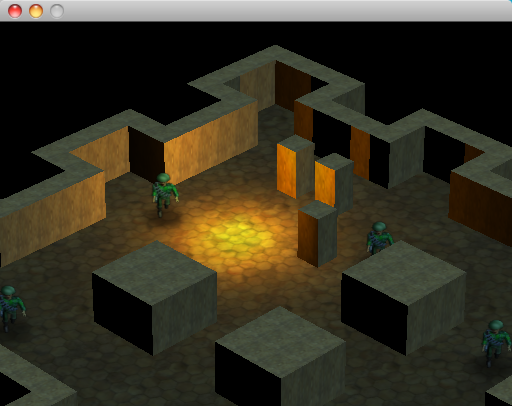
And with wall textures and ceiling textures ..
And now with windows!
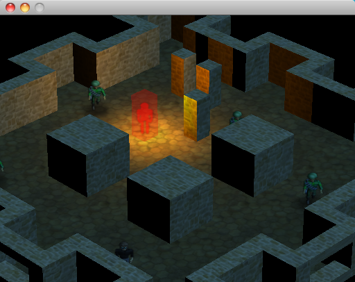
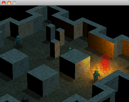
And now with a guy trapped in a box! This is actually the cursor, so when you are trying to walk to some destination this shows you where your mouse or finger is hovering.
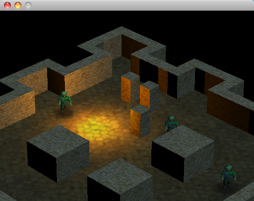
And now with some always-on shadows for the pillars so they look attached to the floor. I considered having dynamic shadows for everything all the time based on the other in-room lighting, but that would get more complex than I care to deal with and doesn’t seem overly necessary.
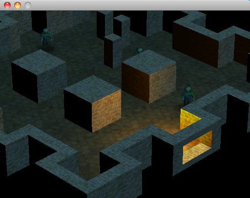
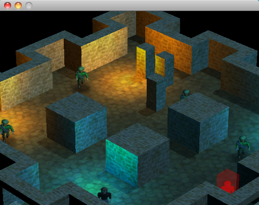
And NOW with multiple lighting sources! I turned off some of the shadow features for the moment, but I’ll probably try and figure out how to re-enable those later.
.. and that’s about all I can manage for one day! Thanks everyone for the feedback, the encouragement to go after the visuals a bit seems to have paid off nicely!
-Phil


